Your artwork is crucial to the overall success of your podcast. It’s the equivalent of a book cover for a book. Everyone says “Don’t judge a book by its cover”, and yet most people still do. It’s the same thing with podcasts.
There are at least a few million podcasts in existence. Having an interesting and easy-to-understand graphic will naturally encourage more people to skim past other podcasts and click on your show instead.
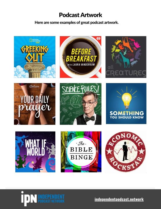
This handout shows some examples of really great eye-catching artwork, as well as artwork that could use some tweaks to really make it work. Notice the difference. It’s big.
which podcast artwork really stands out?
Your podcast needs to stand out in an endless sea of content. Here are some samples to help you see the difference.

