You’ve thought of a winning podcast idea and have probably sat down to record one or two episodes, and now it’s time to market your podcast. Podcast artwork is an excellent way to distinguish your brand, make your podcast more memorable, and help you grow a group of loyal followers.
Podcasts build intimate connections with your audience and offer an auditory experience that many users enjoy. Your podcast artwork is the first and pretty much only visual impression listeners get from your podcast, so it’s vital that you do it right. Today, we’ll be diving deep into podcast artwork. We’ll look at everything you need to know to design stunning podcast artwork today, including our expert tips for conversions. Let’s explore.
What is podcast artwork?
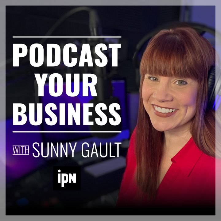
Podcast artwork refers to the cover of your podcast. It’s pretty much the only visual experience your users have with your podcast and is usually one of the very first things that attract potential listeners.
The good thing is, you don’t have to be a graphics design expert to create stunning podcast artwork. All it takes is a little research and some technical know-how of programs like Canva, and you’re well on your way to crafting compelling podcast artwork.
Your podcast’s cover is the first impression users get from your podcast. Good artwork can be the difference between getting featured and getting left in the dark.
When planning your first podcast artwork, it’s essential to check out your competition. What do the podcast covers look like in your chosen niche? Are there any that stand out to you? Why? You want to draw inspiration from anything you think other podcasts have done right and avoid anything that puts you off. We always recommend focusing on the first podcast design your eyes are drawn to. Why is this?
As the first touchpoint listeners have with your podcast, listeners should get a decent grasp of your topic, theme, or podcast ethos. Imagery, font, visuals, and colors will help you establish these in your podcast art. Delve a little deeper and analyze precisely what is your podcast really about? What’s your overall goal? What are you hoping for listeners to gain from your podcast? This should be well represented in your podcast graphics to hook listeners in from the get-go.
Can I design my own podcast graphics?
Yes! You can design your own podcast graphics. You can use a free application like Canva to create your podcast graphics or Adobe Photoshop.
We love using Canva because its intuitive design makes creating stunning podcast graphics absolutely seamless. You can create stunning podcast artwork in mere minutes that looks professional, makes a statement, and is highly memorable.
What size should your podcast cover be?
In this space, size matters. Apple Podcasts, Spotify, and other podcast hosting platforms have a number of requirements your podcast graphics need to adhere to. Apple Podcast has by far the strictest cover requirements, and thankfully many other hosting platforms have developed their requirements from this.
Here are some of the artwork requirements for Apple Podcast:
- Podcast artwork cannot be blurry, misaligned, contain explicit language, use any Apple branding, be an ad or reference drugs and violence.
- Your podcast cover should contain your key art and logo
- Size: 1400 x 1400 to 3000 x 3000 pixels. Apple does prefer the larger sizing, and it must be either a JPEG or PNG file.
- Apple also suggests not putting crucial elements in the bottom fifth of your podcast cover as they may be obscured by play progress, subscription offerings, and labels.
You can also upload episode graphics, channel logos, and subscription banners onto your podcast show. Follow the above guidelines for the basics of Apple’s graphics requirements. The size requirements are the same for Channel Icons and Episode graphics. Other size requirements differ as follows:
- Channel logo: 3000 x 750 pixels, must be transparent PNG
- Subscriptions Banner: 1080 x 1080 pixels.
You can check out Apple’s website for more insight into these guidelines.
How to make podcast cover art that converts – our expert tips:
Now that you know everything you need to about podcast artwork, including sizing, it’s time to get to the fun part – actually creating your podcast artwork design. Here are our 5 expert tips for designing stunning podcast graphics that convert:
Keep it content oriented:
Your podcast graphic needs to highlight your show’s personality, style, genre, topic, and tone. Thus, it’s crucial that you stay content-oriented during the design process.
As your podcast artwork is a visual representation of your show, it should provide potential listeners with a clear idea of what the podcast may be about. It should also be memorable and use color, typography, and design elements to stand out.
If your personality is the center focus of your podcast, your podcast graphic should include you. However, if it’s targeted around climate change, self-care, finance etc., the design should focus on showcasing this.
Less is more:
You want to get your message across without overwhelming your listeners. Nobody likes a design that is too out there and in your face. Because of this, you should be focusing on quality design elements that make an impact rather than overloading your design with details.
A podcast that does this well is Vox’s ‘Unexplained.’ Using a simple black background and typography, ‘Unexplained’ plays on its mysteriousness to attract listeners. Have a look at some of the best performing podcasts within your niche; how are they designed?
Sizing and margins:
Your podcast cover art should be high-quality and should look good at any size. The recommended size for podcast graphics is 3000 x 3000. However, to ensure your artwork passes Apple and Spotify’s strict image quality requirements, convert your art into 55 x 55 and ensure it still looks great. If your image is still clear at this size, you’re good to go!
Always include a margin to keep your image aligned. Some parts of your podcast art can be covered by updates, play progress bars, and more, so it’s important to keep crucial details and design elements centered. Using margins will help them not be obscured.
Use color well:
A color wheel is an excellent tool for making your podcast artwork look seamless without any additional hassle. Choose complementing or analogous colors that fit your theme. The Daily uses complementary colors to create a unique blended effect in their podcast artwork that is eye-catching and memorable.
A word on typography:
It’s crucial that you choose typography that reflects your podcasts’ tone, style and subject. You can choose from several fonts, including Serif, Sans-Serif, and cursive fonts.
Serif is associated with traditional fonts and is a timeless classic. Offering authoritative connotations, this font is often easier to read, making it great for podcast art. Sans-Serif is seen as more contemporary and clean-looking.
Try to avoid using more than two fonts with your podcast artwork, and be wary of cursive fonts. Some cursive fonts have bad readability, which can turn away your audience.
Final thoughts:
Creating your podcast artwork doesn’t have to be daunting! By following this comprehensive guide, you’ll be well on your way to designing winning podcast graphics that convert.
Want to find out more about creating a podcast? Subscribe to our Youtube channel and e-newsletter now. You can also stay up to date with this blog for all of the latest news, tips, and tricks within the podcasting world.