Artwork can “make” or “Break” your podcast
Picture this. You’re on your favorite podcast app, scrolling through all the possible shows. As you scroll, what are you looking at? You’re looking at the image associated with each podcast, which in the podcasting world is called “podcast artwork”. They say you can’t judge a book by its cover, but that’s exactly what people are doing every day with podcasts. Let’s talk about podcast artwork that really works.
In today’s episode, we’re going to discuss…
- Outline artwork requirements and specs
- Common pitfalls to avoid
- Ideas to make your podcast really “pop”
- Ways to create podcast artwork
- How to “test” your podcast artwork
Here are the podcast artwork requirements as defined by Apple.
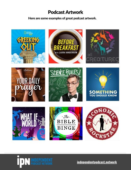
>which podcast artwork really stands out?
Your podcast needs to stand out in an endless sea of content. Here are some samples to help you see the difference.

Episode Transcript
0:02
Picture this, you’re on your favorite podcast app scrolling through all the possible shows. As you scroll, what are you looking at? You’re looking at the image associated with each podcast and in the podcasting world. It’s called your podcast artwork. They say you can’t judge a book by its cover. But that’s exactly what people are doing every day with podcasts. So let’s talk about podcast artwork. That really works. Take it away, radio man. Podcast Your Business!
0:40
Hello, everybody. Welcome back to Podcast Your Business. My name is Sunny Gault. I’m a podcast coach. I’m a mentor. And I’ve been podcasting for 17 years actually got my start in the radio and television space, and then crossed over into podcasting. I am the founder and CEO of a company called Independent Podcast Network. And I am here to help you create amazing podcasts. And this show specifically is focused on podcasts for your business. But even if your podcast is about something else, you’re definitely going to benefit from listening to the show. And how do we do this? How do we create amazing podcasts? We do this by mastering the five P’s of podcasting? That’s right, thank you, radio man. So the five piece of podcasting, this is something that I talk about. I do have a free online course that goes over the five P’s of podcasting, and pretty much everything you wanted to know about it. It’s also on our YouTube channel. It is a free course that’s available to you guys right now, so you can check it out. But in each of these episodes, I go over something that is in one of these peas. So what are the peas, sonny? Okay, here we go prep, which is should you even start a podcast? And what are some of the questions you should ask yourself before you dive into this whole podcasting thing? Plan? Okay, you’ve decided you’re going to start a show, we need to talk about the look and feel for your show and the overall format. And what you’re going to do produce, you’re going to create content, right? either audio or video content. What does that look like? How are you going to record how you’re going to edit, do all that fun stuff, promote? Once your episode is done? You need to tell everyone about it and probably do that on a consistent basis. So what does that look like? And profit? How are you going to make money with your show? Because especially if you’re podcasting for your business, this does need to impact your bottom line, it needs to bring you new customers or needs to impact you somehow with your bottom line. And you know, we go over different ways you can make that work.
2:34
So Mr. radio man, what are we talking about today? Plan. Creating your podcast artwork is part of planning for your show. So you’ve already made the decision that you’re going to do this. And now you need to start putting some of the pieces together and thinking about what you want your show to look like. And your podcast artwork reflects or at least should reflect what your show is about. We’re going to talk about that more today. So all of this takes place usually in the beginning because you are going to need your podcast artwork to create your RSS feed, which is what’s needed to publish your podcast to the online directories. It is also the first impression that many people are going to have about your podcast, which makes it super important in fact, and doing research for today’s show, I found an interesting stat that I can’t prove if it’s true. But nonetheless, I thought it was interesting. It says 62% of new listeners are more likely to listen if they liked the podcast, cover art or art work. I actually think it’s a lot higher than that not sure how they got the 62%. But even 62 is super high, which is why we’re doing this episode. So in today’s episode, we are going to talk about the following things. First of all, we’ve got some basic housekeeping stuff to get out of the way. And that is the artwork requirements and specs because in order to be accepted for your podcast to be accepted into these directories, and for you to get your RSS feed, things like that, you have to follow certain specs. It’s kind of boring, but we’re going to talk about it really briefly and in the link to today’s episode, right. So in the description, there’s going to be a link, that’s going to give you a lot more information because sometimes this stuff changes. And I want to make sure you guys have the latest information. We’re also going to talk about common pitfalls to avoid. So I work with a ton of podcasts, I have seen some horrendous podcast artwork. I don’t want you guys to fall into the same trap. So I’m going to share some of those ideas with you. On the opposite side here. We’re going to talk about ideas that really do work and make your podcast pop. Your podcast needs to stand out in a crowd of other shows. So how do we make that happen? We’ll talk about ways to create podcast artwork so you’ve got some choices on how all this comes to be right you’re gonna do it yourself. You’re gonna hire someone And then I also want to talk about how to test your podcast artwork. This is something I don’t think a lot of people do. But it shouldn’t just be based on your opinion, because you’re a little bit biased. And all of this right. So I’m going to share with you what I do when I’m creating new podcast artwork, and how do I make sure that it actually works for the podcast, we will get started right after this quick break.
5:26
Your podcast artwork can literally make or break your show. And I am not over exaggerating, it is super important. So let’s, let’s just get into it, guys. Okay. Now the first thing I want to talk about are artwork requirements and specs. The first thing you need to know is Apple podcast makes the rules when it comes to what is required. And they do have a specific link that breaks everything down. So if you happen to be, you know, working with a designer, and you just want to send them the link, I’m going to include that in the description below. But let me give you the just because there’s four main things to consider. First of all, the size, you can’t just submit whatever you want. And Apple does give you a couple different sizes, my recommendation is to design for the largest version, which is 3000 by 3000 pixels. Okay. So make sure that is what you actually submit, you can submit some smaller sizes, I don’t recommend you do that just go for the big one. Also, your resolution has to be 72 dpi. DPI stands for dots per inch. And you can set the settings when you’re designing it or when you have a designer that’s you know, working on your artwork, okay, but it needs to be that resolution, it needs to be a JPEG or PNG file type. And it needs to use RGB color space, you don’t need to know a lot about that if you’re not a designer, but RGB stands for red, green, and blue. And it is a color model that reproduces a ton of different colors by combining different intensities of red, green and blue light. So that’s what it is. Okay, there’s different color models out there. So just make sure it’s RGB.
7:13
Now let’s talk about some common pitfalls to avoid. As I said, I work with a lot of podcasters. I’ve seen a ton of podcast artwork, I’ve actually gone hunting for both good and bad podcast artwork to use as examples for my clients. So a couple things I want to tell you that I’ve seen, you know, in far too many podcasts, okay? Their artwork doesn’t reflect what the podcast is about. So think of this as a snapshot, right? This is, again, first impressions are lasting impressions. So this is the first impression you’re giving a lot of people about your show. And they might take the time to read the title, but really, they’re looking at the image first. So it should reflect what your show is about. Far too often I see podcasters using kind of random designs or, you know, things that could apply to any podcast, don’t do that. Make sure it’s reflective of your show, because there’s now millions of podcasts for people to listen to, I think 5 million was the last number I saw. And climbing right. So make sure it reflects what your show is about don’t keep people guessing. Not a good idea. Next, your artwork may not scale. Well what do I mean by that? I mean, it needs to look good in multiple sizes. So earlier, we talked about the 3000 by 3000 pixels. That’s what you’re going to submit it as that is a very large size, because it does need to display on TV monitors and things like that. However, it also needs to look really good on your smartphone, which is where the majority of people are going to be viewing or listening to your podcast on. So when it doesn’t scale, well, that means it looks really good in the big format, but not good in the small format. So what you need to do is when you have a design, look at it big and take it down really small. Make sure you can read everything. So that goes into my next point. People that have font that is too small, that is not a good idea. Having too much text on the screen is a very bad idea. Limit your text. I don’t include taglines and things like that. If you can just get away with the podcast name. Great. If you’re doing this for your business, I have some other ideas I’m gonna tell you about in a second, okay, but don’t overuse text. And don’t use too many fonts. It’s not that you have to keep everything the same font, but it just needs to be used wisely. And I’ve seen people use some crazy fonts that nobody can read. Don’t do that. Okay, make it easy for people. So watch the text.
10:01
All right, now let’s flip the script here and talk about things that really pop and really help your show. I like to focus on the positive as much as I can. Now, I’m going to talk to the people right now that are podcasting for their business. Specifically, I recommend you use a photo on your podcast artwork, because you are an expert in whatever you’re talking about. And we bond with people, not inanimate objects. So let’s say your show is about finance, don’t just give me dollar sign, okay, most boring thing ever, I want to see you, not only am I going to connect with your voice, but I’m going to connect with your photo that is part of your artwork. So please use a photo if it’s for your business. If it’s for your business, make sure your name is somehow on the artwork. But again, you don’t want too much text. So keep it simple. But this should be a reflection of you. So I see your picture, I see your name, I’m making that connection, I am bonding with you, as a potential customer, or client. So make sure you include your name. Also for your business, make sure it reflects your brand. I guess this could apply to multiple things. So if you have a, you know, any kind of brand, if you’re doing a podcast is somehow related to a brand, maybe it’s not really a business or whatever, but you’ve got a logo, you’ve got things like that, yes, make sure your colors are included, right, if you want to include, like a logo for your business, if that makes sense. If it’s simple, if you’re trying to make that kind of direct connection, that’s great. Colors are really important in general. So bold colors work really well, you know, kind of like the reds, the greens, the blues, you know, for my parenting series, which I talk a lot about on this podcast, all of the podcast artwork has a very bright color in the background. And then I have these kind of caricature parents, someone designed for me, and that’s all it is. So you’ve got this bright background, you’ve got these, you know, parents these kind of animated parents on there. And then you have the name of the podcast in bold letters, that is the artwork for my parenting shows. And I’ve gotten a lot of positive feedback on that. And it always grabs people’s attention. And the way we did that, with those shows were to have those bright colors in the background. So be mindful of that. And just in general, make your podcast title very obvious. So yes, we’re going to limit the amount of text on the screen. But really, of all text, your podcast name or title should be the one that draws the most attention of all the text make it very easy for people.
12:50
Okay, let’s talk about ways to create your podcast our work. So here’s, I’m not going to be shy about this, guys. I’m very, very passionate on people not creating their own podcast artwork. Unless you are a designer, this is something you do not want to skimp out on. Please, please, please, I have worked with some podcasts, that if they just would have invested $50, you know, to have a designer actually create their artwork for them, they would have had so many more people find their show, listen to their show, but they were just stubborn about it. And there’s nothing you can do in that. So please don’t be one of those stubborn people. You are putting so much time and effort into creating your episodes for over an extra $50 or $100, whatever you think it’s needed to have the best artwork, I’m telling you, you cannot go wrong with investing in your podcast artwork. So having said that, this is kind of the process that I go through. So I am not an artist, I do have an eye so I can I can tell you if something looks right or doesn’t look right, and usually figure out why. But I’m not really the person to go to to design something from scratch. So this is my process. The first thing I do is my homework. So I go on to podcast sites or podcast apps. I look at various artwork, especially artwork that’s in your genre, your podcast category, look at what else is out there. See what you like, see what you don’t like. And basically save some examples, right? You want to have samples, whether you’re designing your own artwork, which again, I don’t really recommend, or you’re hiring someone else, you want to have samples. So that’s the first step look and see what else is out there. If you are determined to do your own podcast artwork, then Canva (canva.com) does have some templates that you might be able to work with. So that’s better than just doing something from scratch if you don’t have the background, so that would be my recommendation. The other thing you can do is as you’re saving your artwork or not your artwork, but the artwork for the shows that you like, you can always reach out to those shows and ask who their designer is, I have done that in the past. So that’s something to consider as well. If you don’t have any idea of who to hire, I recommend you go to Fiverr, F-I-V-E-R-R .com. And you can find designers on there of all types of price ranges, you can kind of get screwed over on Fiverr. If you’re not careful, I just want to be honest. So this is another reason why having those samples. So if you have that you can send it to them and be like, I like what you’re showing me in your showcase here. Can you do something like this? And then since you have that sample, then they can say yes or no. And maybe you have to pay a little bit more, because that’s a little bit more involved that you guys can negotiate and figure out a rate. In general, I think you can get good podcast artwork for 100 bucks or less in general. But you can also pay a lot more, if you’re not careful.
16:06
Once you have your podcast artwork, I want you to run some tests. This is where a lot of people kind of fail. Okay, they don’t do this final part. But I think it’s one of the most important pieces to the puzzle here. First of all, look at it yourself, of course, you’re going to do that. Where does your eye go first? Because if that’s where your eye is going, that’s probably where most eyes are going. And is that really what you want to be drawing attention? Should it be on your picture? Are you wearing something that makes your whole picture really pop and make you stand out? So is that what you want people looking at first your picture? Or is it something else? Is it the podcast title, see where your eye goes and see if that’s where you want it to go. I also want you to review the artwork at different times don’t make a split second decision. Once you see it for the first time, take it in, put it to the side, maybe take some mental notes on what you like what you dislike, come back to it at another time. Okay, because it might look a little bit different. It’s really weird how that works, but it’s true. And in the meantime, you can send it to friends and family, see what they think. The other thing I like to do is I like to take a screenshot of other apps in like, let’s say some app store, right. So let’s say it’s Apple podcasts, I take a screenshot of other apps in the same category as what my podcast is going to be in. And then I superimpose the image into the page. So I can see what the artwork looks like when compared to similar podcasts. That’s just a little trick that I use. And I’m looking for a couple different things. I’m looking for scalability, right? I’m also looking to see how my podcast pops or doesn’t pop when compared to other shows. I’m trying to get the perspective of someone who is just doing a search for random podcasts, how does my podcast compare to the other ones already out there. So that’s a nice little trick. If you guys can do that. And you have the graphic ability to do that. It’s very helpful.
18:12
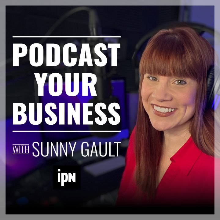
Now, I want you to pause this recording for a second, I want you to pull up the artwork for the podcast you’re listening to now podcast your business, because everything I’ve just told you to do, I have done in this artwork. So this is a podcast that is for my business. I’m all about teaching people how to podcast right? What have I done here you see my picture. I have a bright red shirt because I really wanted to make things pop. And it’s really funny guys, thisimage was not a professional photo, I literally set up a camera on a tripod and took a bunch of photos probably like 100 photos of myself. I took it in different shirts, because I wasn’t sure what was going to work best. So I had a red shirt. I had a black shirt. I think I had a navy blue shirt. I had myself doing different things with a microphone. Should I have headphones on? Should I not have headphones on? I just tried a bunch of different things and pick the best one. So that was not a professional photo. I had amazing professional photos that I was going to use. And when I sent it out to friends and family, they said there’s no podcasting stuff in here. You have to show podcast stuff in the background. I went oh, man. Let me save to take a picture. So just so you know, that’s how the picture came about here. I had someone design the artwork for the text behind podcast your business, right. So that’s in big bold letters. And I had it say with Sunny Gault. So that’s on there as well. So you see my picture, you see my name, and then the logo for independent Podcast Network is on there as well because this is related to my business and I wanted to incorporate my logo to help promote my business. So this is a great example for you guys to use. But I have more examples that I can share with you guys. So we’re gonna take a quick break. On the other side, I’m going to tell you about an amazing free handout that not only shows you really good examples of podcast artwork, but also ones that kind of missed the mark. We’ll be right back.
20:13
So remember earlier I was telling you guys, when you’re creating podcast artwork, it’s really important to do some research and find already existing podcasts or work that you really like. Anything I recommend that you guys do, I have already done. So in doing this, I found a bunch of artwork I really, really liked. And I found podcasts as well, that needs some help. Okay, they’ve made some of the pitfalls that we were talking about earlier. And I have created a PDF. And it’s basically two pages. And the first page is podcast artwork that really works well. And the second page is artwork that really could be improved. And you’re going to see especially if you look at this, as you’re listening to the podcast, if you want to listen to it again, you will see some of those things that I was talking about and the huge difference it makes. So please check that out. Also go to our website, Independent Podcast Network (https://indpendentpodcast.network), because we have a ton of free resources that’s available to you right now this minute. blog posts are released every week podcast episode, we have videos, I have a bunch more handouts like the free one I’m offering you guys today. And if you’re brand new to podcasting, we have podcast courses on the site as well to teach you how to podcast from scratch. There is no need to spend hundreds and hundreds of dollars on some course I’m giving you this information for free. So take advantage. All right. Until next week, remember…. you should start a podcast!

